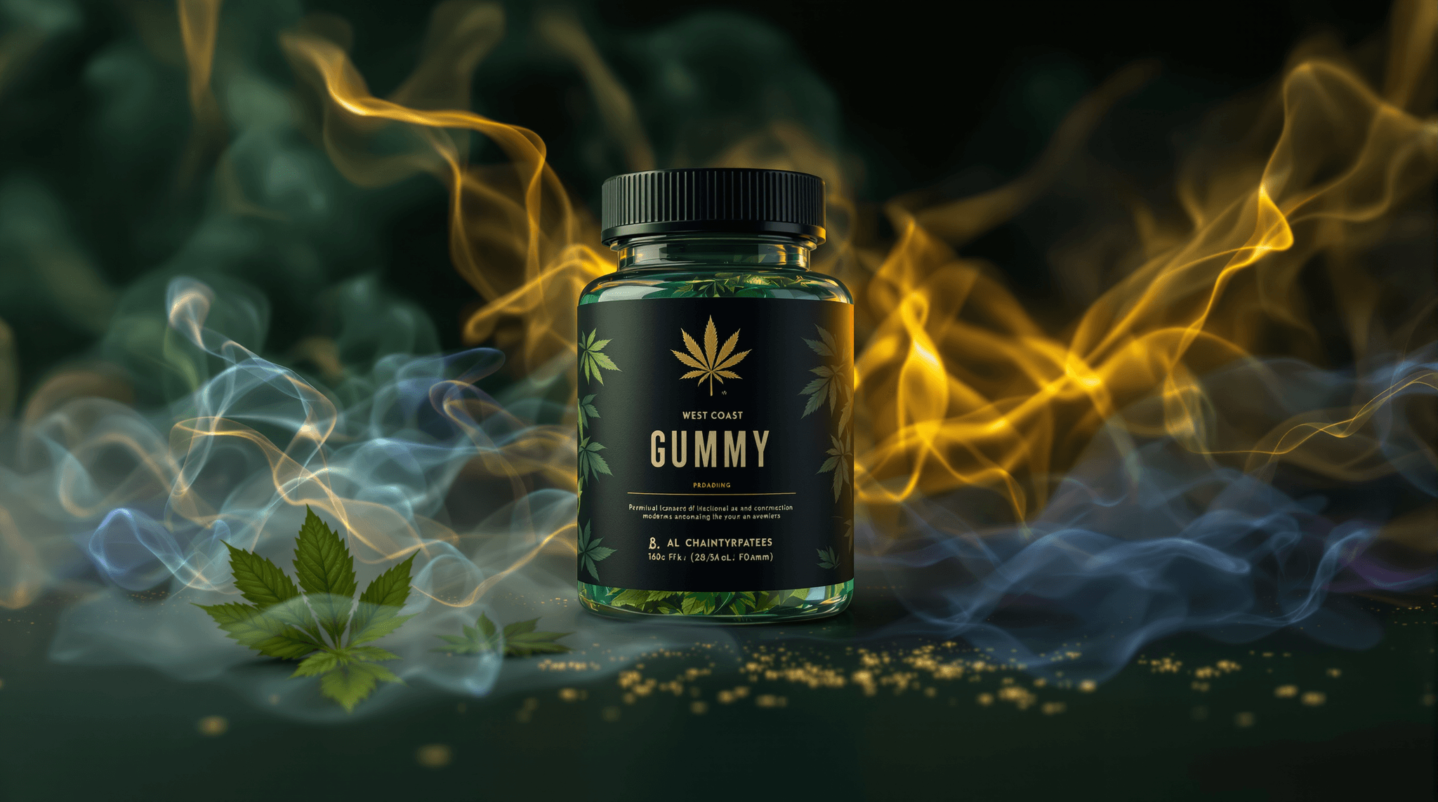
Flip a bag of gummies over before you ever open it. The back panel tells you more than the front ever will — total milligrams, milligrams per piece, the ingredient list, the batch ID, and a little QR code that points to a lab report. That back panel is where cannabis gummy packaging stops being marketing and starts being a document. At Dr. Greenthumb's, we treat both sides of the pouch with the same respect, because a bag has two jobs: look like something you'd want on your shelf, and tell you exactly what's inside without you having to guess.
This is a walk through how modern gummy packaging and edible branding get designed — the materials, the structure, the required panels, the print choices, and the culture that shaped the whole look. No health talk, no dosing-for-an-outcome advice. Just how the bag gets made and how to read one like you know what you're doing.
The child-resistant shell comes first
Before a designer picks a single color, the package has to solve a structural problem: it has to be child-resistant and re-sealable. That's non-negotiable in every regulated cannabis market, and it shapes everything else. The two dominant formats for gummies are the child-resistant stand-up pouch with a press-to-close or slider zipper, and the rigid tin or jar with a push-and-turn lid.
The stand-up pouch is the workhorse. It's usually a laminate — several thin layers bonded together. A typical build has an outer print layer (often PET for sharp graphics), a middle barrier layer that blocks light and oxygen, and an inner food-safe seal layer that touches the gummies. That barrier layer matters for storage: light and air are what degrade a gummy's texture and flavor over time, so the film is doing real work long after you've admired the front.
The zipper is its own engineering choice. A basic press-to-close costs less; a slider with a locking mechanism reads as more premium and passes child-resistance testing more consistently. Once you notice the difference, you can't unsee it on a shelf.
What the law makes you print — and where designers hide it
Every regulated edible carries a set of mandatory elements, and the design challenge is fitting them without turning the bag into a wall of fine print. The usual required marks include the universal THC symbol (a triangle with an exclamation point in many states, a diamond in others), the total cannabinoid content in milligrams, milligrams per serving, a net weight, an ingredient list, allergen callouts, a manufacture or packaging date, and a batch or lot number.
Good edible branding treats these as design elements, not afterthoughts. The milligram math usually lives on the front in big type because it's the first thing a shopper checks — a 100mg pack split into 10 pieces means 10mg per gummy, and shoppers do that division in their heads at the shelf. The batch number and date get tucked onto a back seam or printed inline during filling. The QR code linking to the certificate of analysis often sits near the ingredient panel so a curious buyer can scan it on the spot.
Here's the shopping-literacy tip worth carrying: match the batch number on the bag to the batch number on the COA it links to. A real third-party lab report names the testing lab, lists the batch, shows cannabinoid content, and reports pass results for pesticides, solvents, and microbials. If the code goes to a generic brand homepage instead of a batch-specific report, that tells you something too.
Ingredients on the panel — read them like food
A gummy is candy with cannabis extract folded in, and the ingredient list reads like candy. You'll typically see a base of sugar and a gelling agent — pectin for a fruit-snack chew, gelatin for a springier bite. Then corn syrup or tapioca syrup, citric or malic acid for tartness, natural and artificial flavors, colorings, and the cannabis distillate or live-resin extract that carries the cannabinoids.
Pectin-based gummies are worth calling out because they've become the standard for a lot of brands making vegan claims — pectin comes from fruit, gelatin comes from animal collagen. If a bag says vegan, the gel system is your proof. The ingredient panel is also where you spot the difference between a distillate gummy (refined, often flavor-neutral extract) and a live-resin or full-spectrum gummy, which lists a strain-specific or full-spectrum extract and sometimes botanical terpenes for aroma and taste. That's a flavor and format distinction — not a health one.
Color, type, and the hip-hop DNA of the look
Now the fun part. Cannabis edible branding pulls from a few visual traditions at once: candy packaging, streetwear, and record-cover art. The candy influence is obvious — bright fruit colors, glossy or soft-touch matte finishes, playful type. The streetwear influence shows up in bold logo lockups, limited-run color drops, and the same box-logo instinct that built skate and hip-hop apparel brands.
Dr. Greenthumb's sits squarely in that lineage. B-Real built Cypress Hill on a sound and a visual identity that were instantly recognizable, and that same instinct carries into how a bag should look — authentic, a little irreverent, unmistakably ours rather than a clone of every green-cross template on the shelf. The best packaging in this space doesn't try to look like a pharmacy. It looks like culture, because that's where cannabis actually lives.
Print technique backs the design up. Soft-touch matte laminate gives a pouch that velvety feel and kills glare under dispensary lights. Spot gloss or foil makes a logo pop against a matte field. Digital printing lets a brand run short, seasonal drops without the cost of huge minimum orders — which is why you see limited-flavor releases show up and sell out.
Storage is a design decision too
Packaging and storage are the same conversation. The barrier film, the resealable zipper, and an opaque print layer all exist to keep gummies stable. Keep an opened bag sealed, out of direct sunlight, and away from heat — a hot car turns a firm gummy into a puddle and can cause pieces to fuse and lose their coating. A cool, dark cabinet is the move. Some brands add a small food-safe desiccant or dust the gummies with a sugar-and-anti-caking blend to keep them from sticking together in humid climates.
That anti-stick coating you feel on a fresh gummy? Usually a mix of sugar and a starch or tapioca-based dusting agent. It's cosmetic and functional — it keeps the pieces separated so they don't clump in the pouch.
How to read a gummy bag in ten seconds
Put it together and you can size up any pack fast. Check the front for total milligrams and do the per-piece math. Flip it and confirm the batch number, the date, and the QR link to a batch-specific COA. Scan the ingredient list for the gel system (pectin vs. gelatin) and the extract type. Feel the pouch — a locking zipper and a proper barrier film signal a brand that spent money where it counts. Then judge the art on its own terms.
Great packaging respects you on both sides of the bag: the front earns a spot on your shelf, and the back tells you the truth about what's inside. That's the standard we hold ourselves to, and it's the standard worth holding any brand to.
This content is for educational purposes only.


